The Challenge
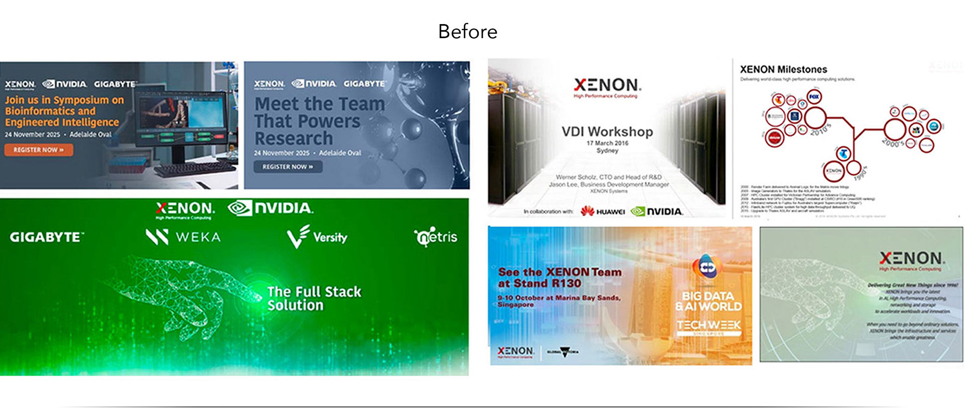
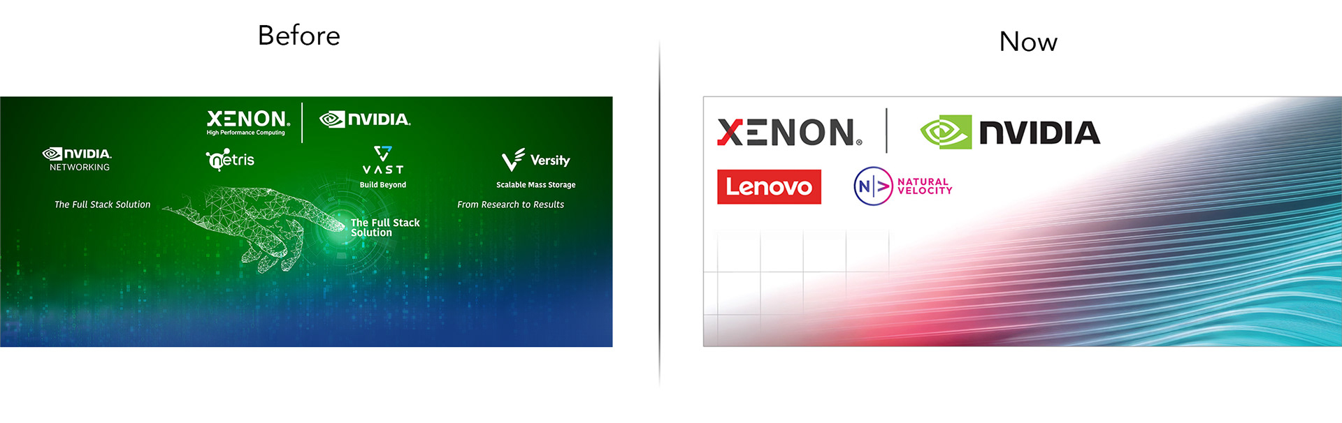
My challenge as Creative Director was to bring structure and consistency to this fragmented visual landscape without losing the equity of an established brand. Rather than simply replacing the logo, I focused on building a complete visual system around it, defining how color, typography, imagery, graphics and layouts should work together across every touchpoint.

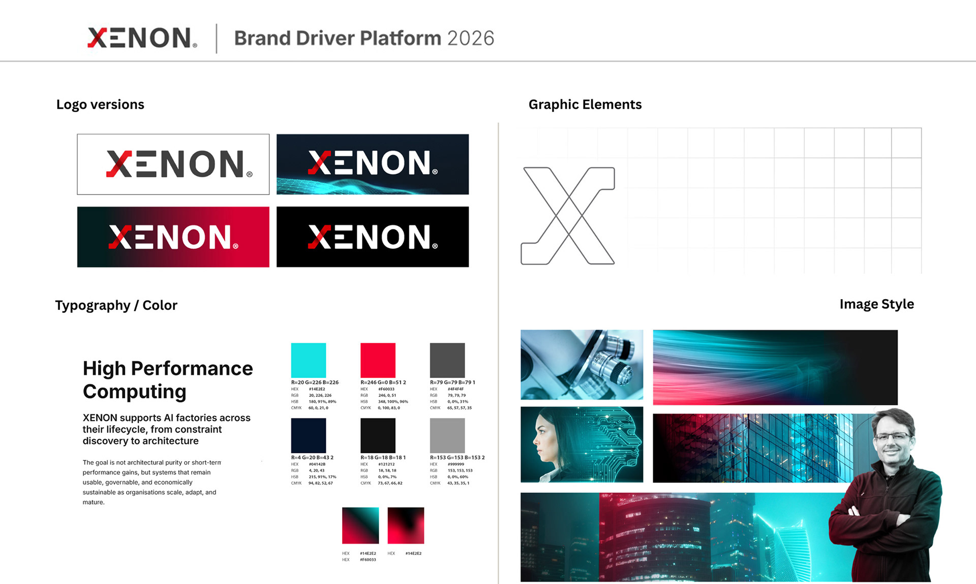
For me, the task was not to start from scratch, but to create order within an identity that already had years of history behind it. The existing brand had recognition and equity, but it needed a clearer visual framework that could bring all of its individual elements together.
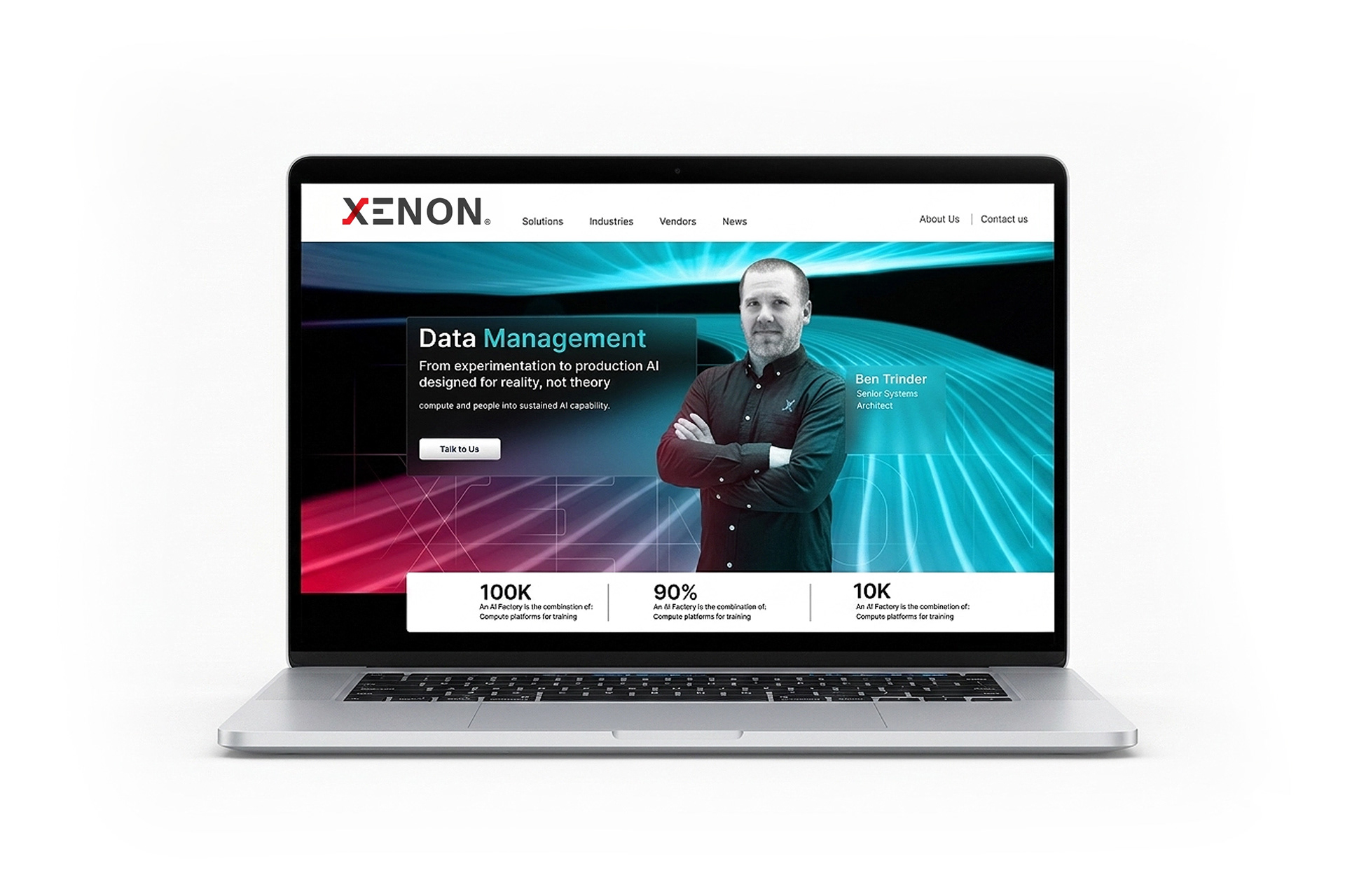

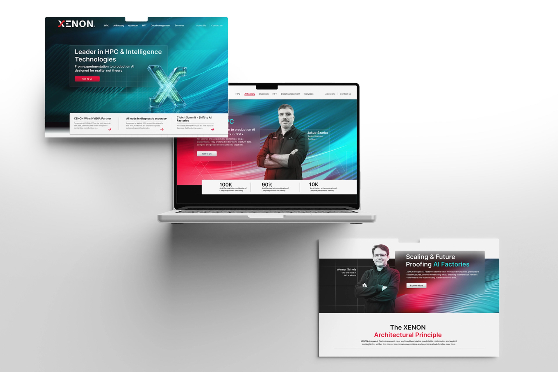
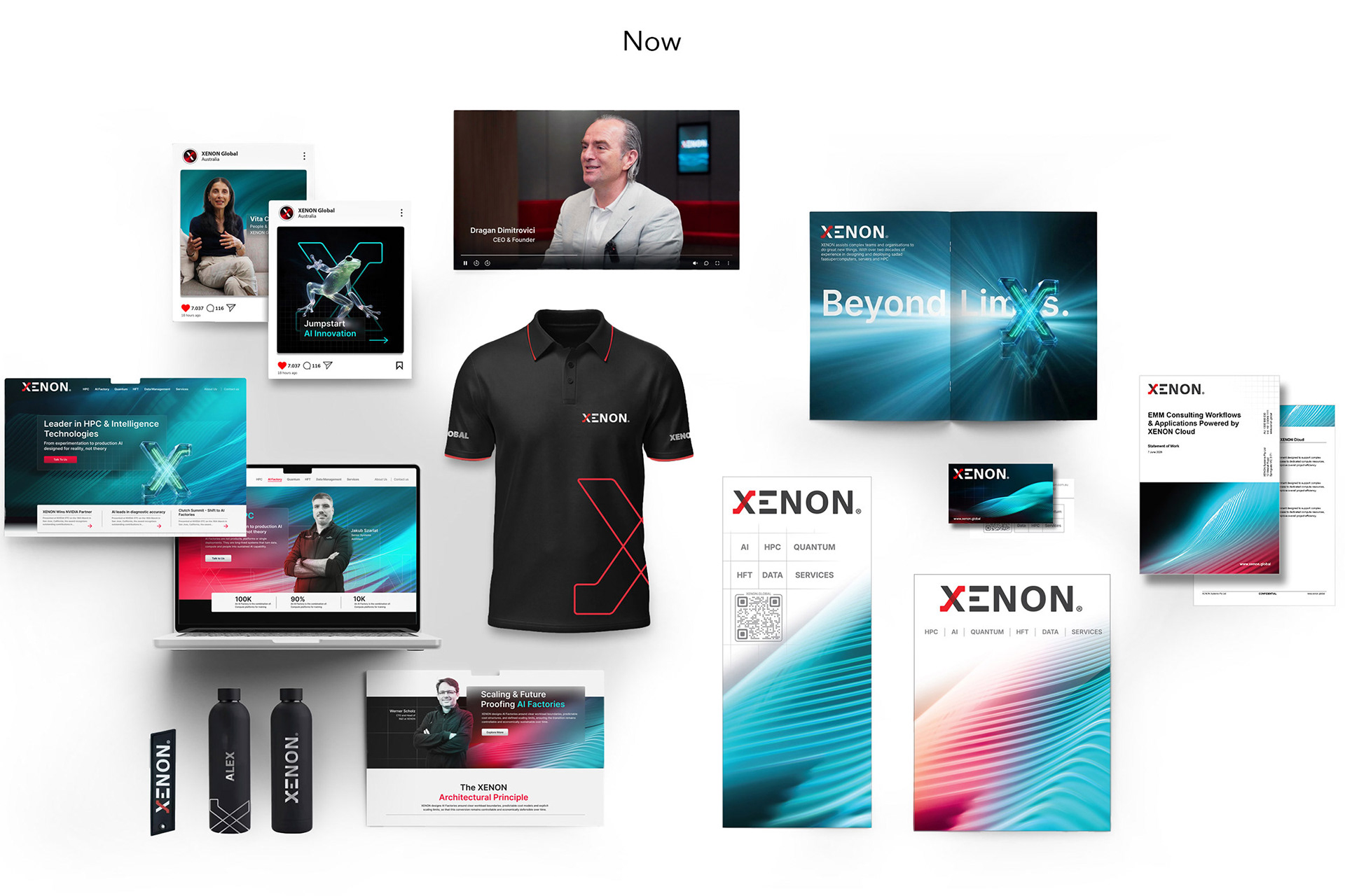
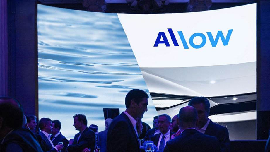
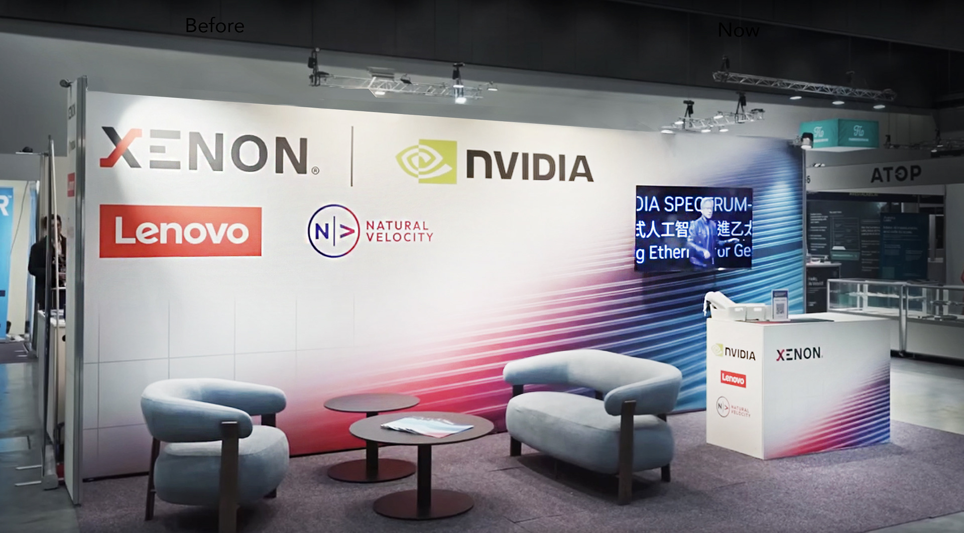
A major part of the project was also creating consistency across a large and varied ecosystem. The identity needed to work equally well across websites and UI, presentations, social media, campaigns, events, exhibition spaces, printed collateral, video, photography, merchandise and internal communications.
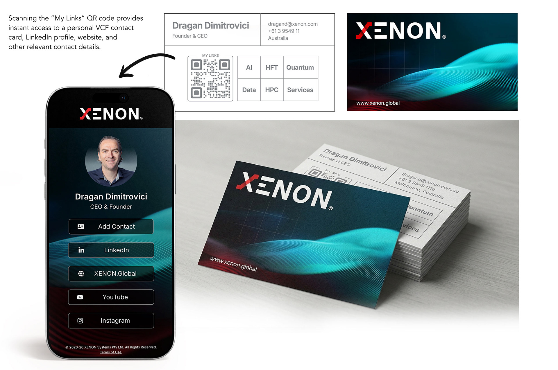

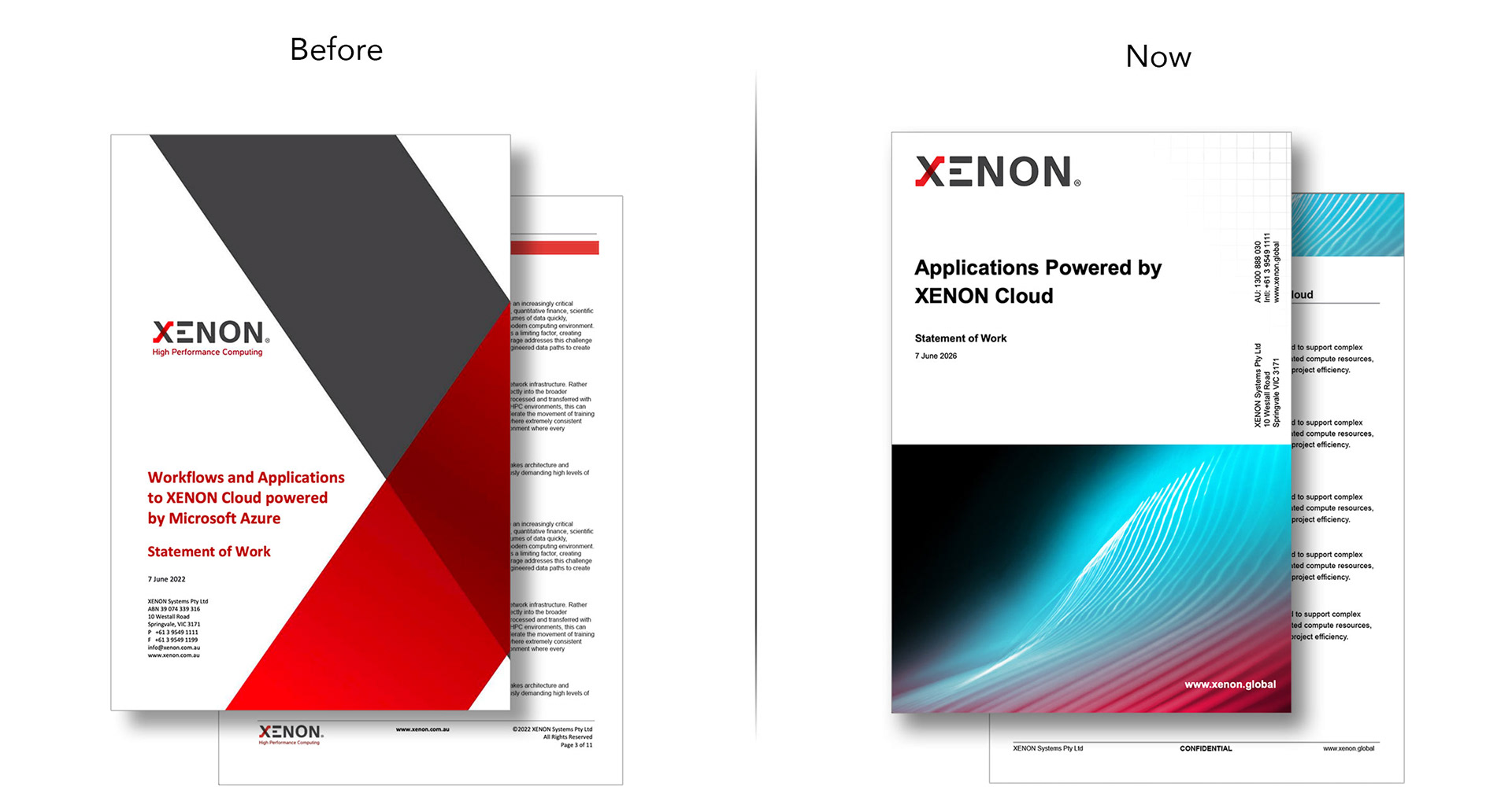
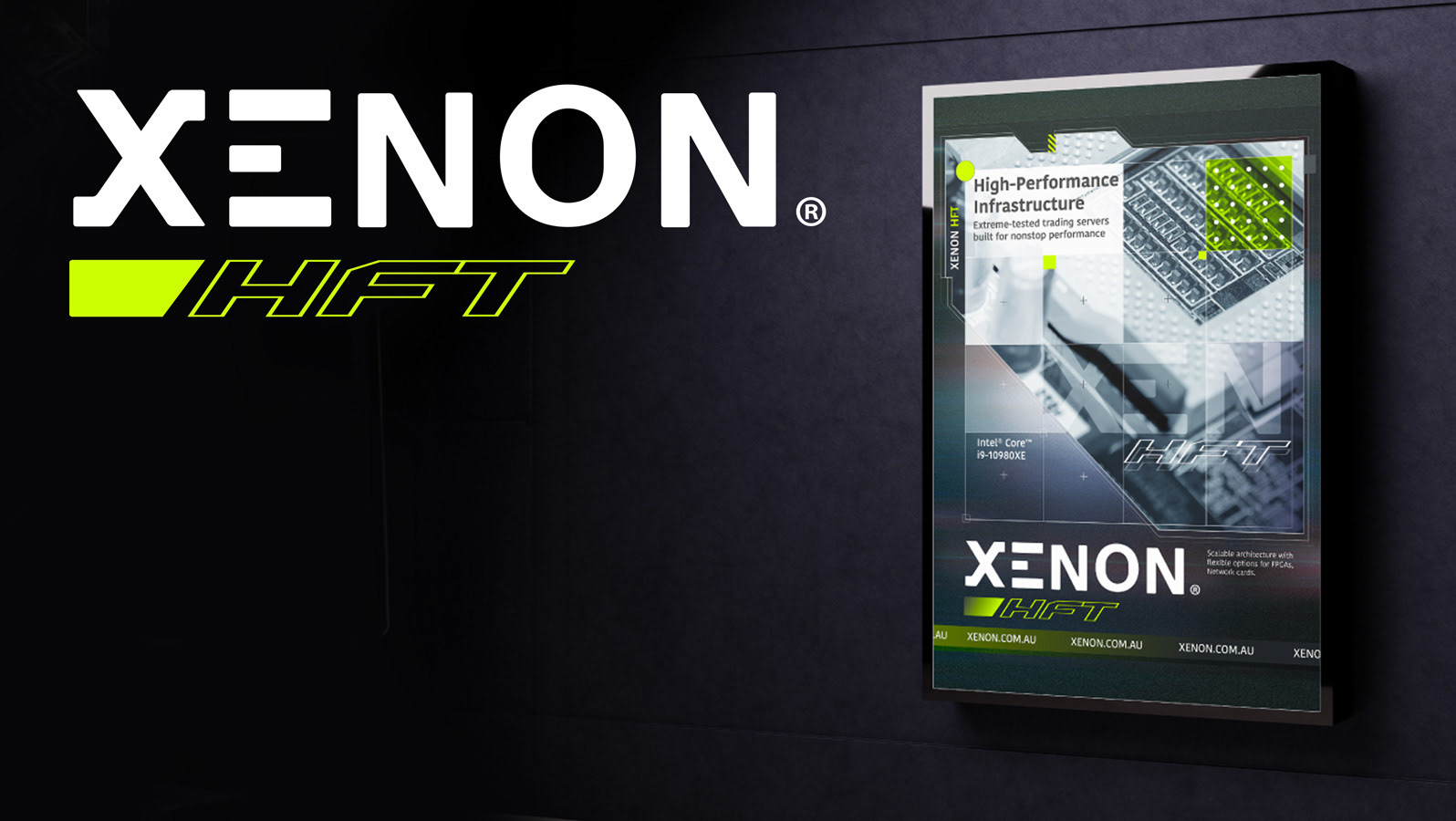
The new direction brings greater consistency across XENON and its specialist technology divisions, while introducing a clearer visual system across digital platforms, communications and brand touch points.
The Result
The result is a more confident, contemporary and distinctive brand presence that better reflects the scale and ambition of the business, while retaining the recognition and heritage built over decades.